


As one of the leading responsive web design services in Calgary, we often get asked how having responsive design can help with brand marketing. It is essential to start with an understanding that, unlike fifteen years ago, today we live in a multi-screen society. That means not only is your site being viewed on desktop devices but across smaller screen sizes, some as small as four inches.
Responsive Web Design Statistics (2021)
The growing importance and impact of mobile device use is easily seen in consumer choices and user behavior. Our top 21 researched stats reflect these trends and effects of responsive web design for online brands and their customers:
- 57% of All Web Traffic Comes from Mobile Devices (source)
- On an average, 8 out of 10 consumers would stop engaging with a site if its content doesn’t display properly on their device (Adobe)
- 62% of companies increased their sales by designing responsive mobile platforms for their websites.
- 48% users say if the business site of a company is not mobile friendly, they’ll take it as an indication that business is simply not caring.
- On an average, 83% of global consumers reportedly multi-screen using 2.23 devices at the same time (Adobe)
- 40% of smartphone and tablet owners search for B2B products on their devices (source)
- 57% of consumers wouldn’t recommend a business without a mobile-friendly website.
- 88% of online shoppers are less likely to return to a site because of bad user experience.
- 94% of users create their first impression of a website based on web design alone.
- 68% of companies with a mobile-first website increased their sales.
- Web design alone forms 75% of the judgement of a company’s credibility.
- The average user needs only 50 milliseconds to form an opinion about a website. (source)
- 75% of consumers base their opinion of an e-commerce website on design alone. (source)
- A superb overall UX design can boost website conversion rates up to 400%. (source)
- 94% of online shoppers don’t trust outdated or poorly designed websites. (source)
- 74% of users are most likely to return to mobile-friendly websites. (source)
- 72% of users expect companies to have a mobile-ready website design. (source)
- Responsive web design statistics – 90% of people use multiple devices to visit the same website. (source)
- 73.1% of consumers will leave a site with non-responsive design. (source)
- User experience statistics show a better UX design can skyrocket conversion rates by 400%. (source)
- 80% of consumers do not engage with content that doesn’t display well on their device. (source)
If you want your website to rank higher, get more traffic, make more sales, provide a great user experience and receive more referrals, you need a mobile friendly website.
Due to this increasing popularity of mobile devices, an adaptive site design is recommended for all online brands. This includes local businesses, online stores, corporations and non-profits. The importance of responsive web design cannot be denied when it comes to your website’s success, no matter the size or niche of your brand.
As a responsible web design agency, we’ve followed Google’s announcements regarding mobile-friendliness over the years. Having a mobile friendly website definitely is part of Google Search’s ranking factors. It just makes sense now to build with a “mobile first web design” approach. Otherwise, your website’s search visibility and rankings will be hurt right from the start.
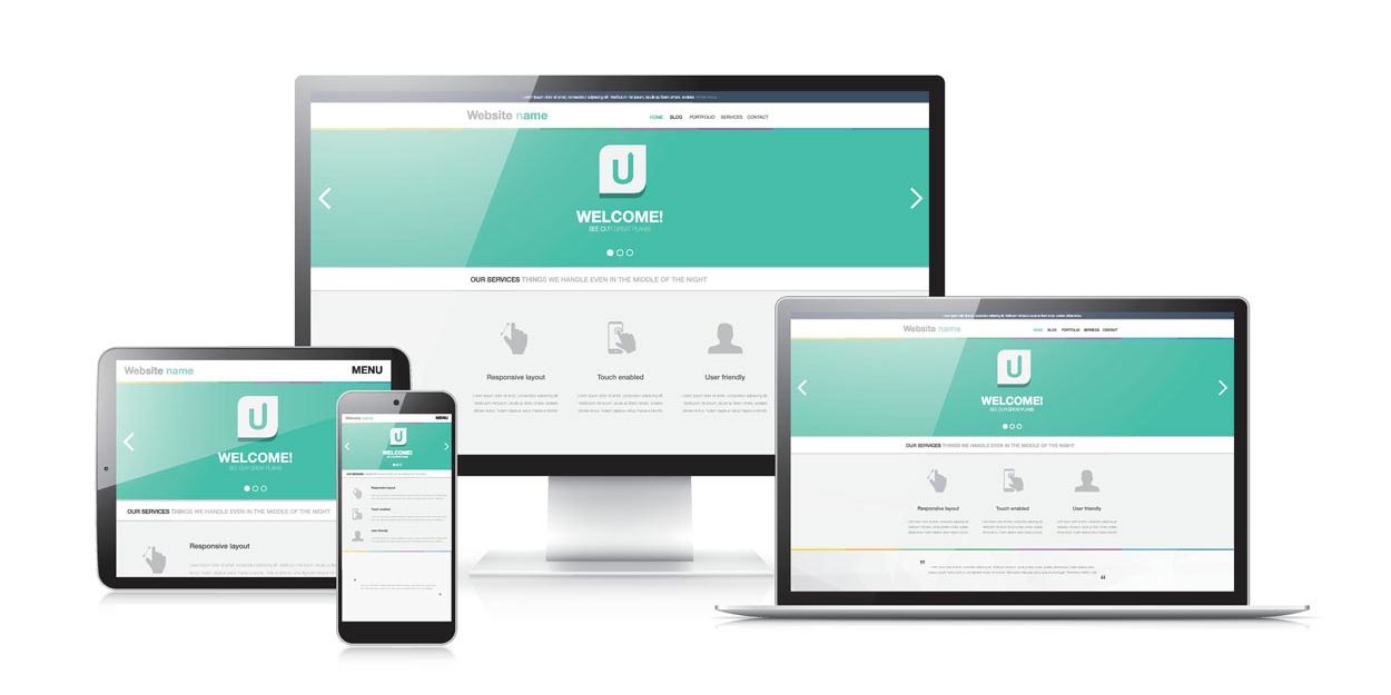

How Responsive Web Design Works
There are many guidelines and techniques for responsive web design that we must be aware of during the Web development and Web marketing stages. To explain how responsive web design works, we must look at some key design and development techniques:
- User Experience (UX) and Interface Planning – to determine how all elements of the web design need to adjust at various screen sizes.
- Responsive Web Design Workflow – extends from initial interface planning, allowing developers to explore the weaknesses and strengths of a design through testing and revisions before launching.
- Cascading Style Sheets – allow us to customise when branding, navigation and content elements adjust to the various responsive web design resolutions. These are called “breakpoints” and help to determine things like the minimum width to display a text navigation or hamburger menu.
- Browser Window Rendering – we can also provide unique and detailed code versions and instructions to a specific browser type or version when that browser fails to support the code as intended for various screen resolutions. This helps to avoid responsive web design issues from occurring, which can negatively affect your brand’s user experience and even lose customers.
WordPress, the world’s leading Content Management System (CMS) and website builder, is the best responsive web design software available in 2021. It accommodates for many of the adaptive web design needs found in leading edge web solutions within its core software, themes and WordPress plugins. It remains the best tool for responsive web design available to Calgary web designers and their clients.
Without paying attention to your website’s mobile-friendliness, your branding efforts will not gain the same traction nor reach the same levels of success online.
Responsive Website Design Makes Brand Marketing More Cost-Effective
When mobile devices first appeared, many businesses would have to maintain two entirely separate websites. One of them will be a mobile version of their site, with the other being for non-mobile visitors. That approach is still used by some developers. We do not recommend this approach as it can get very expensive and confusing to maintain.
Depending on your industry, brand marketing is already probably costing you a lot of money. Why add to the bill by having two separate websites? Most responsive web design services like ours can help you cut costs significantly by switching to responsive design.
That way, you have a single design that appeals to everyone. Advanced responsive web design techniques are a worthwhile investment. They deliver a faster, more fluid, web experience for your customers, no matter if they are on desktop, tablet or smartphone.
You can achieve this by building around the various responsive web design layout sizes. After all, branding requires consistency, and this is the best way to be consistent with your visual messaging.
Fully Responsive Web Design & Content Management
One of the pillars of successful brand marketing is ensuring that your content is fresh. We’re talking about the latest offers, deals, information, news etc. Keeping things fresh and relevant is only possible if your website is easy to work with, and that’s where responsive design comes in.
One of the advantages of responsive web design is the overall structure of the coding. By separating the coding and style sheets from the content management environment, it is easier and faster to make changes to a responsive website using a drag and drop editor. You don’t have to worry about how those changes look on a mobile device unless, of course, you’re making structural changes to the design.
Here’s a great article for Everything You Need to Know about Mobile Website Design In 2021.
The flexibility of responsive design is a huge advantage since you can make a few quick tweaks and updates, then publish! Do all of this without having to worry about how the website will look across multiple devices.

Does A Better User Experience Equals More Sales?
As someone investing in branding your business or products, you certainly don’t want to ruin your users’ experience. A bad user experience, especially on your brand’s website, can turn away potential visitors and consequently buyers. It can especially be the case if those buyers are visiting the website via a mobile device.
For example, if your Calls to Action aren’t mobile friendly, your visitors may entirely miss the next step that they need to make. By adjusting the placement and visibility of a Call to Action depending on the screen size can therefore increase or decrease your sales and site traffic flow.
Here are 5 Techniques to Make Mobile Call to Action Buttons Intuitive.
You don’t want the mobile version of your website to be slow or the pictures to appear clipped off from the screen. The website also needs to be easy to navigate on a touchscreen-enabled device.
As a company that has undertaken many responsive web design projects in Calgary, we can tell you from experience that the user experience can make or break your branding efforts. When designing a responsive website, we make sure that features like zooming and scrolling and entering in information to place an order are quick and easy across all mobile devices. That way, people visiting your website aren’t disappointed by the experience.
Mobile Web Design & Search Engine Optimization
One of the reasons we are the responsive web design services of choice is our websites rank well. Search ranking is a significant part of helping a business brand and sell products or services.
Google no longer prioritises websites that aren’t mobile-friendly. That’s why if ranking a website matters to your business; it is important to ensure that your website is responsive.
Is your current website “mobile friendly”?
You can check your site here on Google’s own mobile friendly test page. This mobile friendly web design tool will scan your site and provide essential feedback for a number of mobile friendly factors.
While there are undoubtedly other ranking factors to consider, having a responsive design is a good start.

“Mobile Friendly” also Means “Easy to Manage”
A responsive web design layout is ideally suited to businesses that don’t have the time or the manpower to continue tweaking how their website looks. Most small businesses don’t have the resources to hire a designer to work full-time handling every aspect of the website’s capabilities and features. So, the ability of the business owner to make small changes themselves is essential.
A properly built responsive web design should be easy to manage. When done right, the majority of the adaptive coding appears behind the scenes. This allows the site content to be managed by someone with minimal web content management training.
Whether it is a social media update, a new blog post, or adding the latest promotions, the ability for the website to automatically scale and make everything look good on all screen sizes is invaluable.
In our opinion, the best responsive web design is one that offers our clients the most value. That’s why we work with business owners to craft responsive designs that fit their digital marketing and branding needs in the best possible way.
Responsive Web Design Calgary & Area
Your brand’s reputation and reach are too important to ignore. Making sure your website is not just “mobile friendly” but “mobile optimised” is key to provide the best results for your leads, customers and rankings. Our responsive web design company in Calgary and Cochrane, Alberta, offers a mobile-first approach for all of our custom website development projects.
